Using match transparency
26 Feb 2019.
Stb-tester v30 includes a new feature: Searching for a reference image that has some transparent pixels. This blog post describes three ways you can use this new feature that makes writing test-scripts much easier than before.
Matching buttons with unknown text
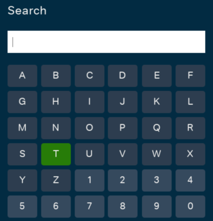
Take this keyboard for example:

We want to find the currently selected key. The selection is green, unlike the rest of the keys, but each key looks different – they have a different letter on the inside. With transparency we can have a single reference image that will match this selection no matter which key is selected.
In the video below we use the GNU image manipulation program to construct a suitable reference image:
Steps:
- Open the screenshot.
- Use the crop tool to crop to the area you want to match.
- Right-click on the layer in the “Layers” pane and click “Add Alpha Channel”.
- Use the selection tool to select the area that you want to be transparent.
- Press the “delete” key on your keyboard.
- Use “File > Export” to save the image as a PNG to your test-pack.
Here’s the reference image we saved:

The middle of the key may look like a white box in your web browser – but it is in fact transparent.
We can now use this image in our test scripts directly:
matched = stbt.match("keyboard-key.png")
assert matched
print "Selected key %s in region" % (
    stbt.ocr(region=matched.region), matched.region)
More realistically we’d use it as part of a Page Object to find the selected key:
class KeyboardKey(stbt.FrameObject):
    @property
    def is_visible(self):
        return bool(self.region)

    @property
    def region(self):
        m = stbt.match("keyboard-key.png", frame=self._frame)
        return m and m.region

    @property
    def label(self):
        return stbt.ocr(region=self.region, frame=self._frame)
You can use the KeyboardKey Page Object like this:
key = KeyboardKey()
print "Selected letter %s in region %s" % (key.label, key.region)
Finding outline selections on carousels
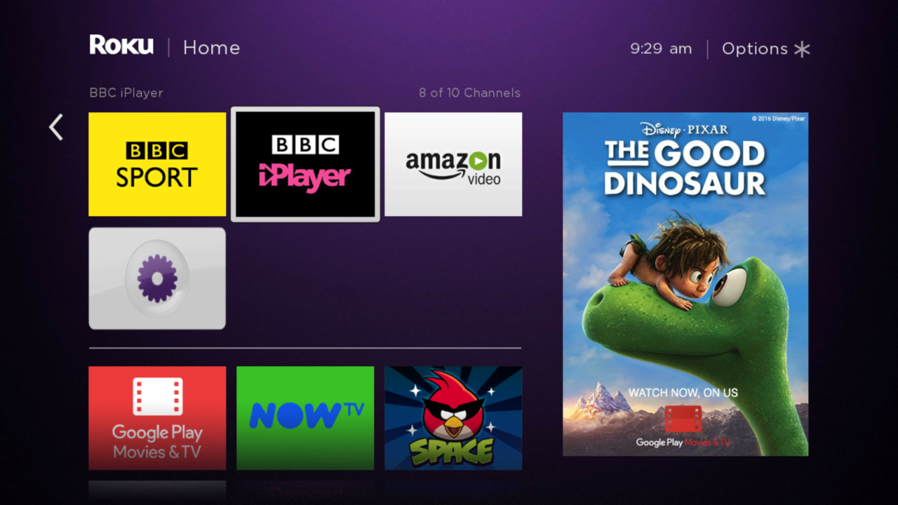
On the Roku’s Home page, the focused item is shown by a white outline:

How to find which item is currently focused? Create a reference image as before:

This will match the currently selected tile, independent of what the tile contains.
We can now use this in our Page Objects:
class CarouselSelection(stbt.FrameObject):
    ORIGIN = (117, 149)

    @property
    def is_visible(self):
        return bool(self.region)

    @property
    def region(self):
        m = stbt.match("roku-outline.png", frame=self._frame)
        return m and m.region
Determining which page we’re on and checking background details
A current fashion in set-top box UIs is the “clean look” – UIs showing as little as possible so as to not distract from the content. Here’s an example:

Most of the pixels here are going to change depending on what content is available and what is currently selected. That doesn’t mean there’s nothing to match on. Using transparency we can invert our idea of matching: instead of looking for a part of the frame that is unique to this page, we start with an example frame and delete the areas that contain dynamic content.
This can be useful for:
- Identifying what page you’re currently viewing – typically as a part of the
implementation of the
is_visibleproperty onFrameObjectclasses. - Checking for regressions/changes in UI layout.
We end up with a template like this:

entertainment-grid.png
This captures the blue background and the light-blue box surrounding the text on the right hand side. There are very few features in this image that we’re matching against. This template will only match against frames that are similarly featureless in these areas. In practice this may be enough to identify this page, but it can also be used as a “first pass” to discard non-matches before doing more expensive checks involving OCR.
This type of matching is very fast because the template is the same size as the frame so we don’t need to search all the locations in the frame to find a match.
Example
Here in our is_visible implementation we use the transparent template to check
the page before calling OCR to read the title.
class EntertainmentGrid(stbt.FrameObject):
    @property
    def is_visible(self):
        return (self.match("entertainment-grid.png", frame=self._frame) and
                self.title == "Entertainment")

    @property
    def title():
        return stbt.ocr(region=stbt.Region(90, 50, 193, 38), frame=self._frame)
This is great for test-script maintenance. Full page transparent templates are easy to view and to understand, and when your UI changes they’re easy to update too.
 stb-tester.com